Brand Identity
Education
Typography
Grid System
Education
Typography
Grid System
2020
The Terraforming
The Terraforming is a research postgraduate programme by the Strelka Institute that focuses on the subjects of urban transformation, technology and the ecosystems that are necessary to continue our lives on Earth. The word “terraforming” is defined as a transformation of a planet’s ecosystems and satellites such that they will be suitable for human life, but the environmental effects of the anthropogenic are such that this practice will soon need to be applied to the Earth itself.
The Terraforming is a research postgraduate programme by the Strelka Institute that focuses on the subjects of urban transformation, technology and the ecosystems that are necessary to continue our lives on Earth. The word “terraforming” is defined as a transformation of a planet’s ecosystems and satellites such that they will be suitable for human life, but the environmental effects of the anthropogenic are such that this practice will soon need to be applied to the Earth itself.

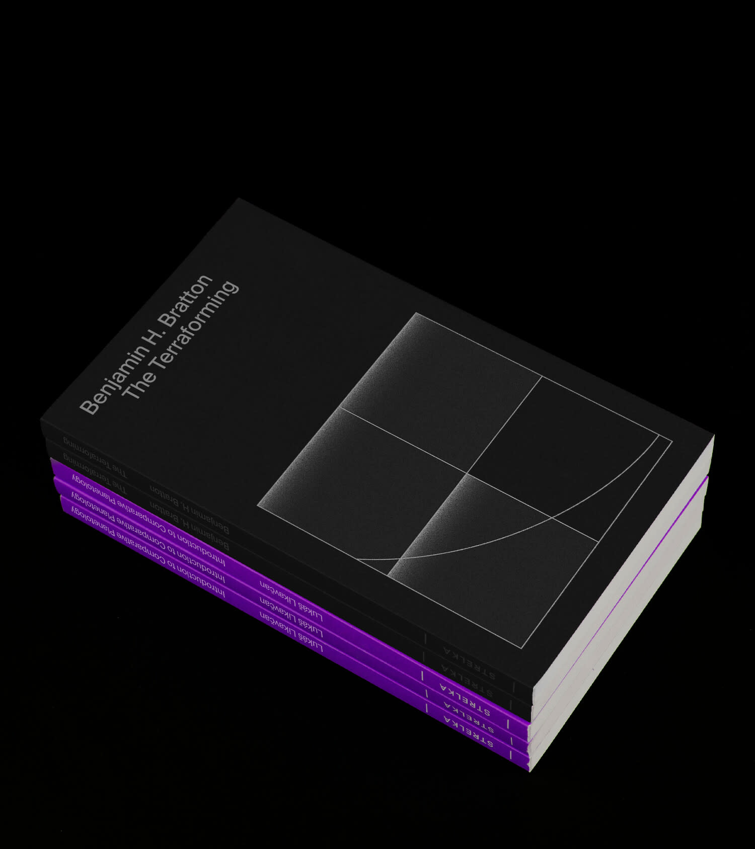
Dr. Benjamin Bratton, the Program Director of The Terraforming, described the course as an imaginary space expedition. He asked me to draw inspiration from the visual language of the USSR and NASA space programs in my search for the brand identity.


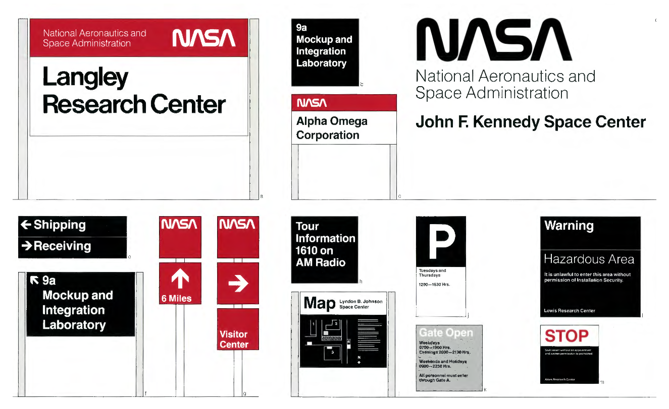

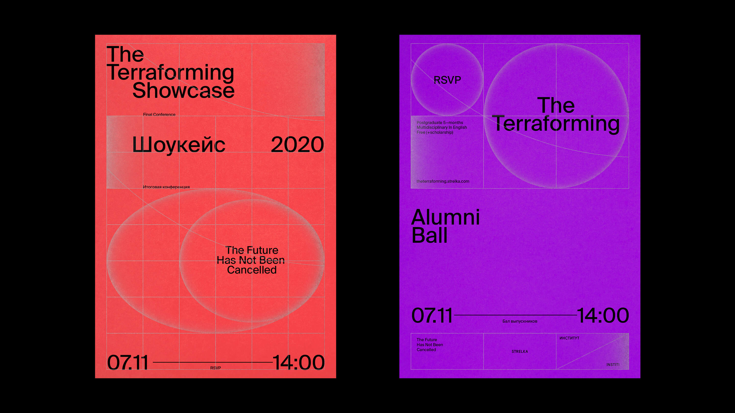
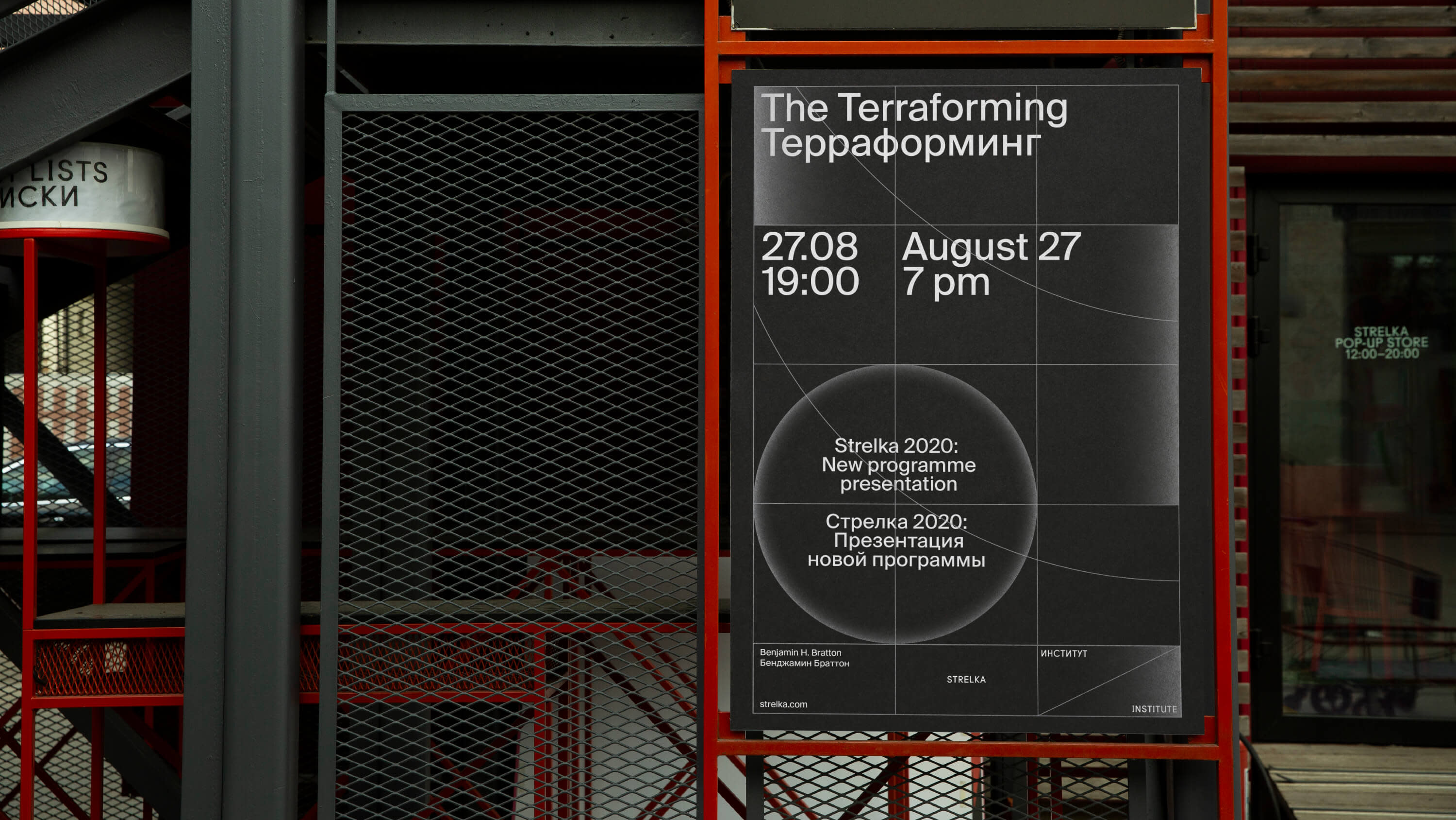
I incorporated a simple and clean typographic system from NASA's brand guidelines. The linear graphics and gradients were drawn from the visual language of Soviet popular science magazines. The grid alludes to the basic brand identity of the Strelka Institute and star maps.
I wanted to use silver printing, but the print runs were small, and offset printing with Pantone was cost-prohibitive. Fortunately, I found a production facility with digital printing using silver ink. This allowed us to print highly impactful flyers, covers for an essay series, and planners as gifts for our students.


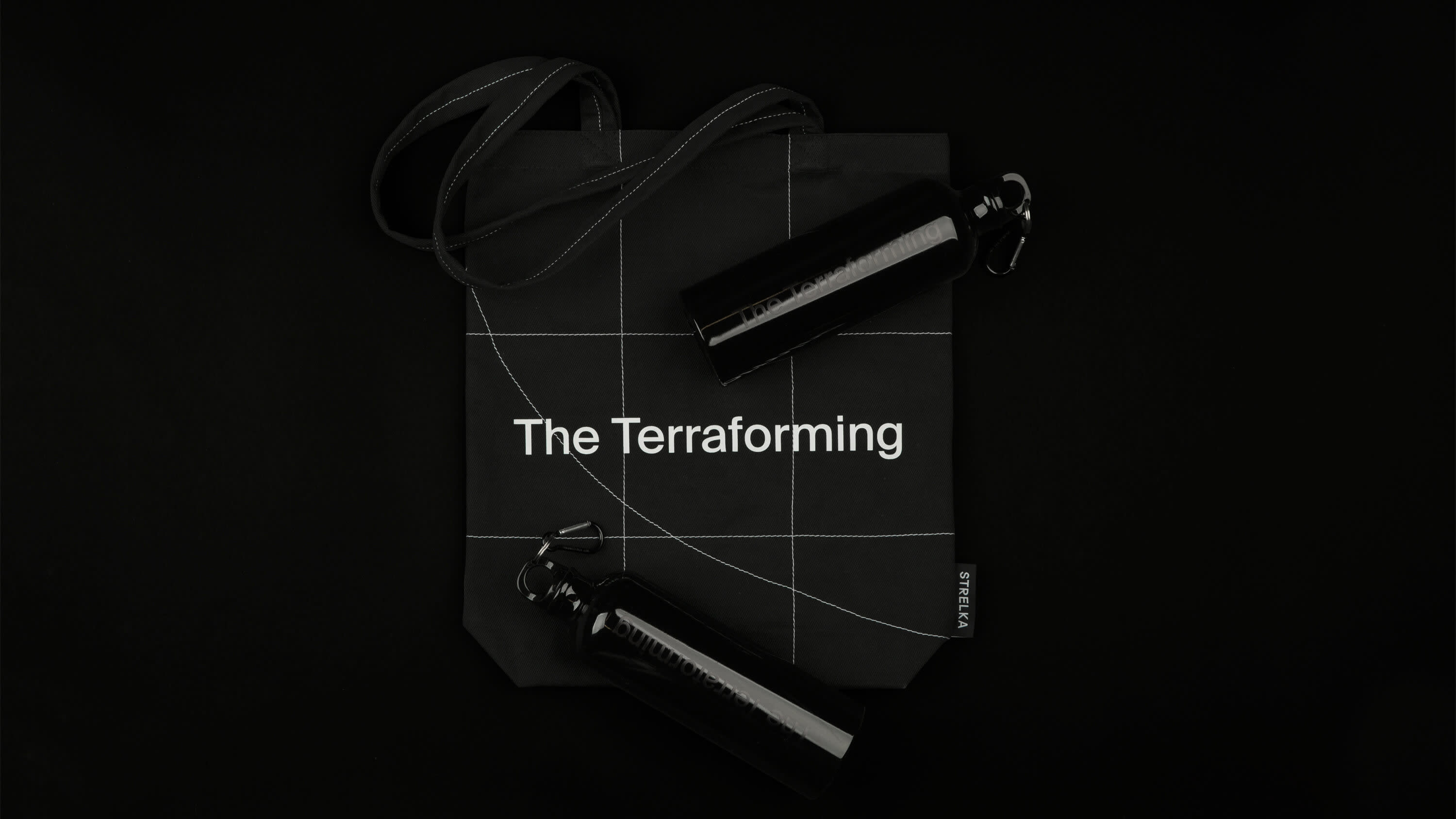
I always pay attention to the print production. For the bags, we decided to combine technologies: the typography is silk-screen printed, while the mesh is embroidered, providing a tactile element that can be felt.
There were also water bottles in the gift pack for students. I decided to print black letters on black bottles, achieving a delicate and tactilely pleasing result.
There were also water bottles in the gift pack for students. I decided to print black letters on black bottles, achieving a delicate and tactilely pleasing result.