Editorial Desugn
Books
Books
2019–2020
Strelka Press Redesign
Strelka Press, the publishing branch of the Strelka Institute, focused on translating and distributing pivotal texts in architecture and urbanism.
By 2019, the old approach had become outdated. The books lacked a wow factor and failed to grab attention in bookstores. The old template involved small font sizes, suitable for architecture students but inconvenient for everyone else. Our goal was to revamp the institute's books, making them more inclusive and visually appealing.
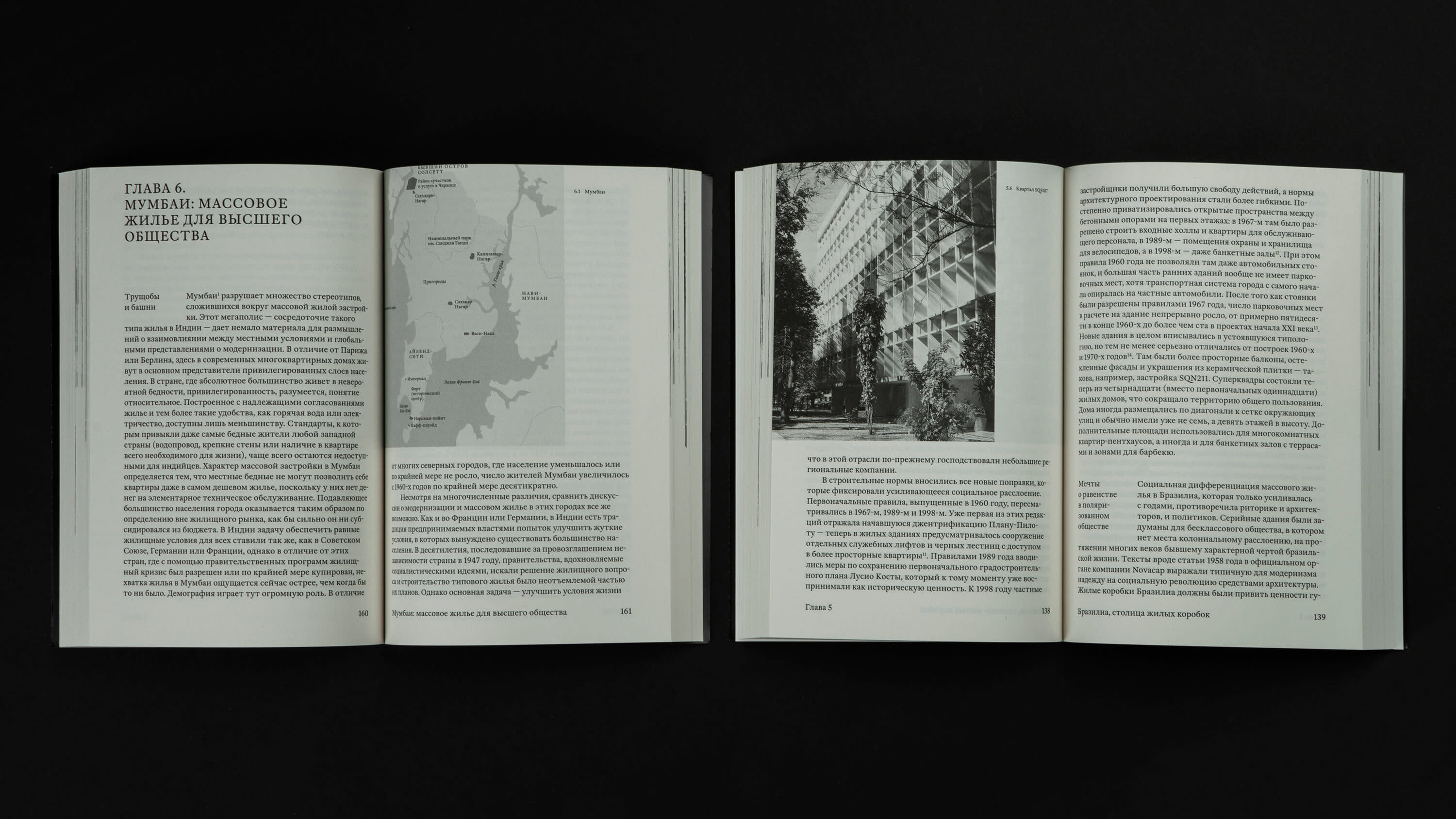
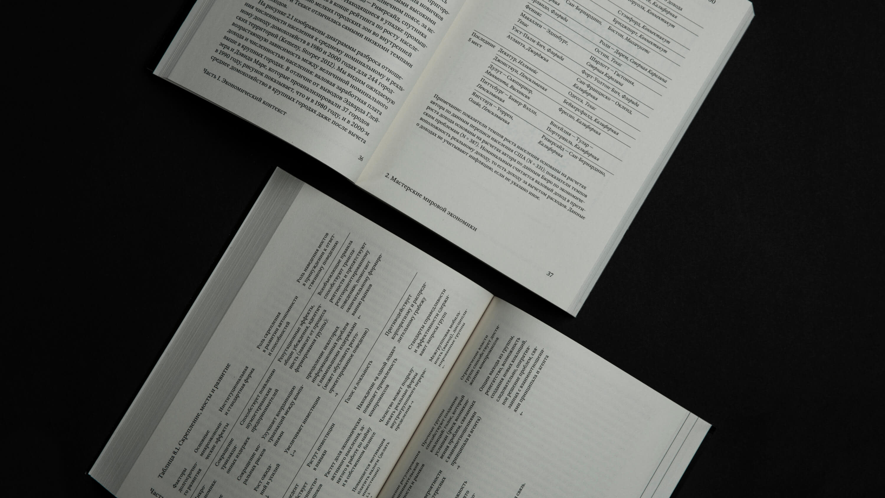
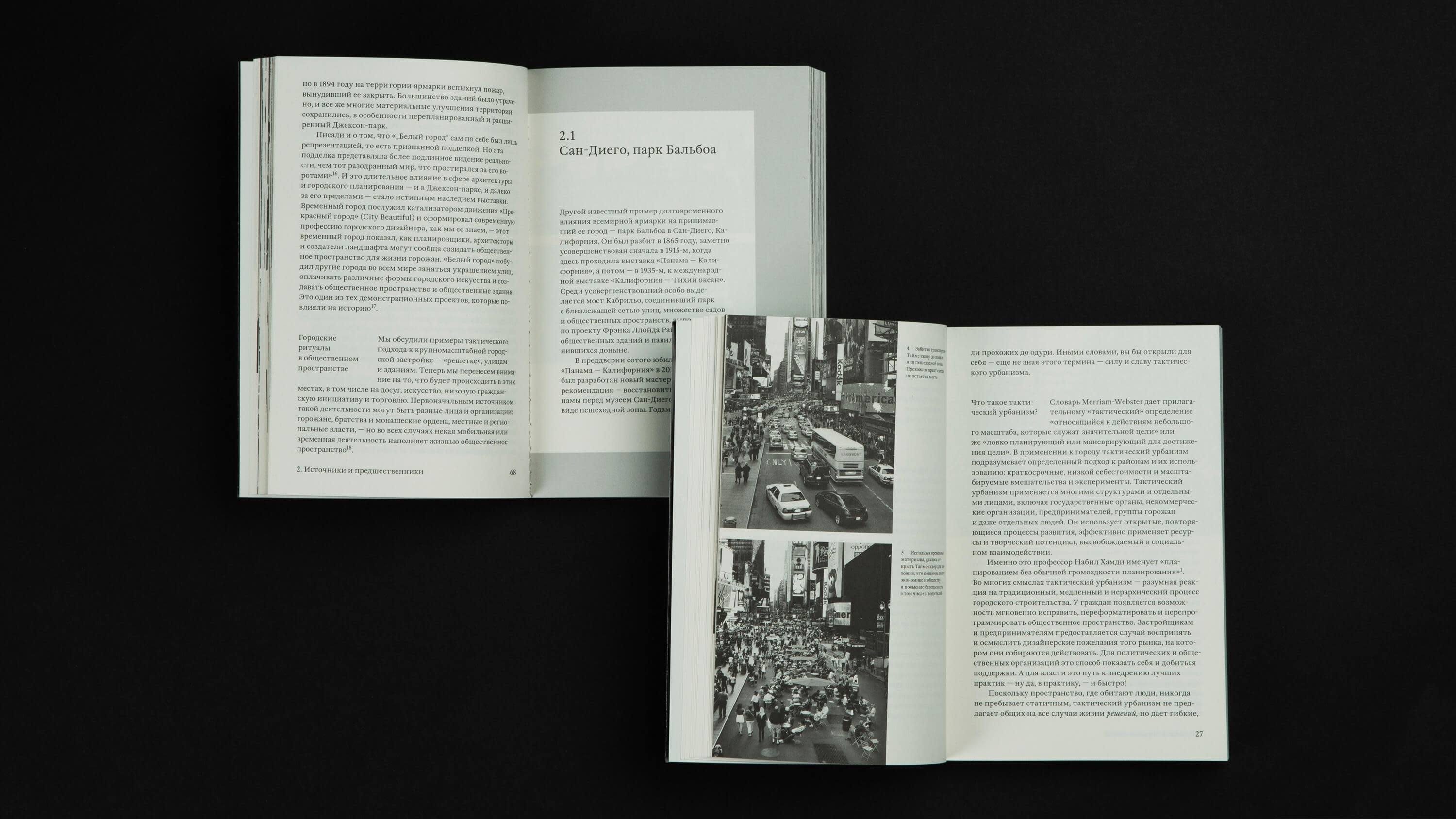
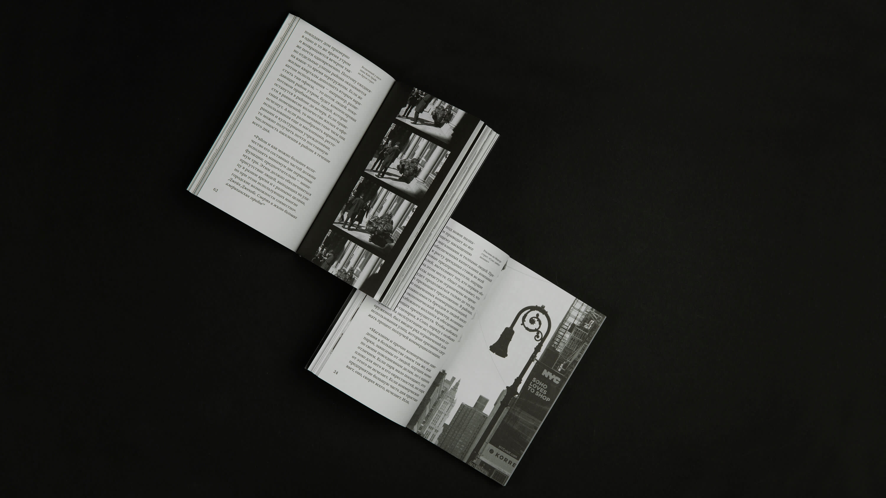
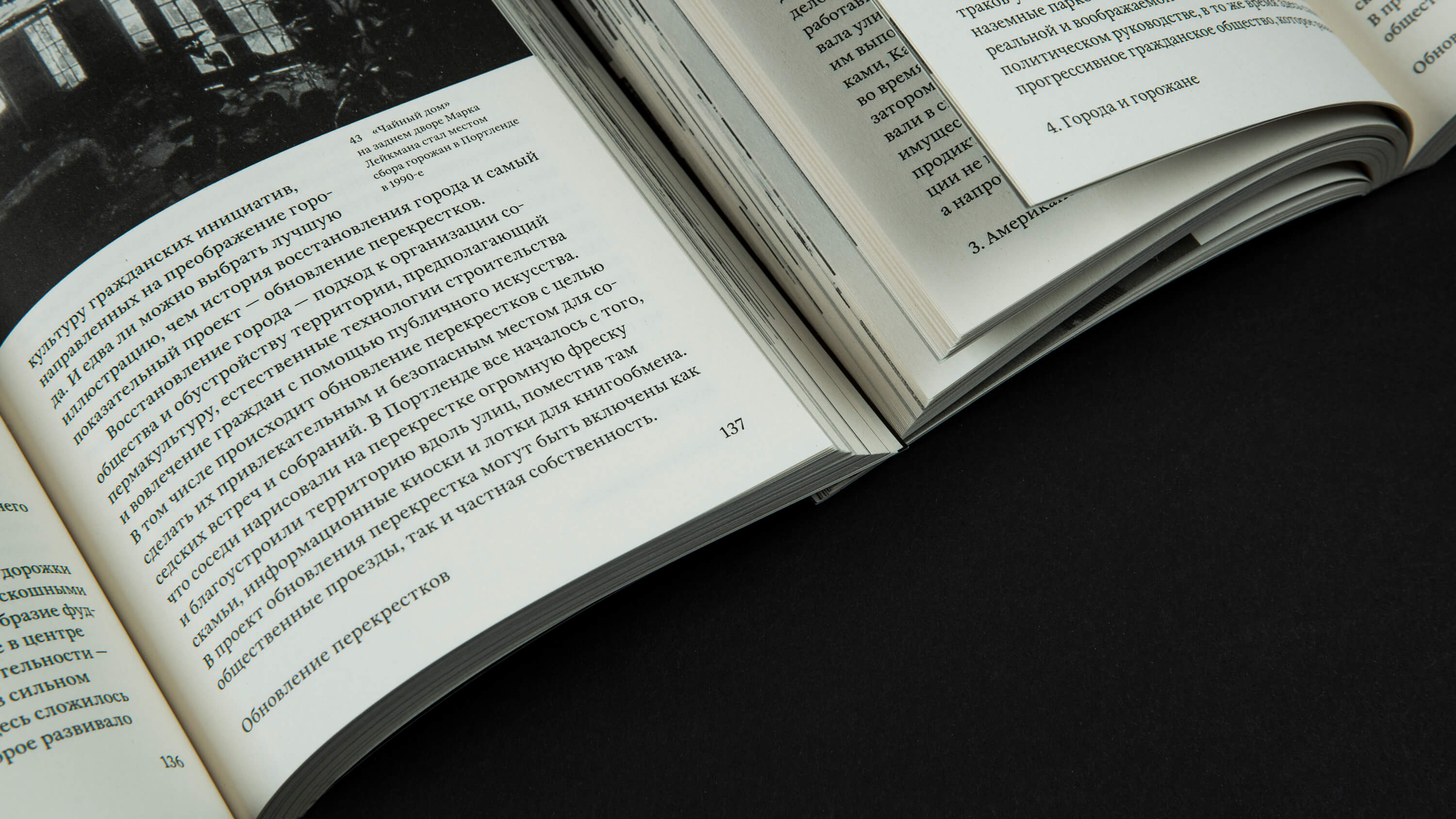
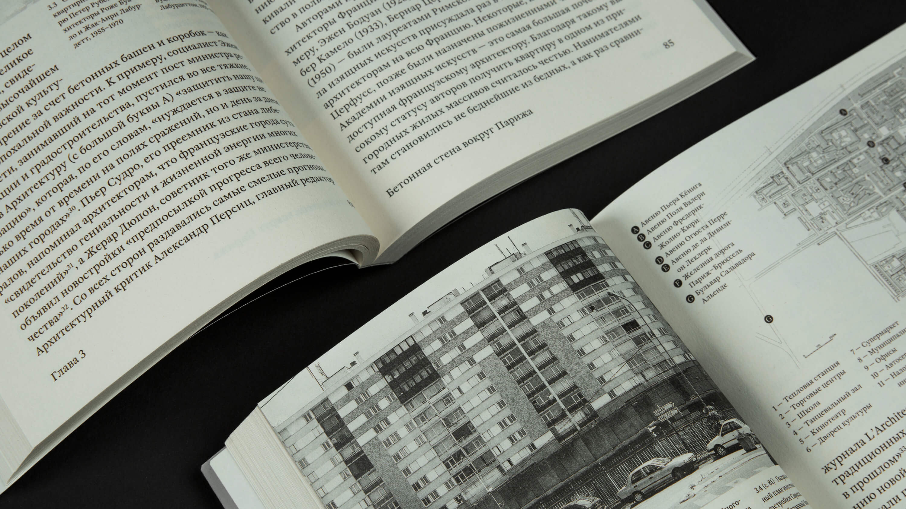
I crafted a versatile grid, typographic system, and set of rules that allowed for the elegant presentation of any content—whether it be lengthy texts, photographs, diagrams, plans, maps, tables, or graphics.
Thanks to the incorporated design solutions, a multi-level header system, and ample page capacity, the increase in font size had minimal impact on the production costs.
Thanks to the incorporated design solutions, a multi-level header system, and ample page capacity, the increase in font size had minimal impact on the production costs.
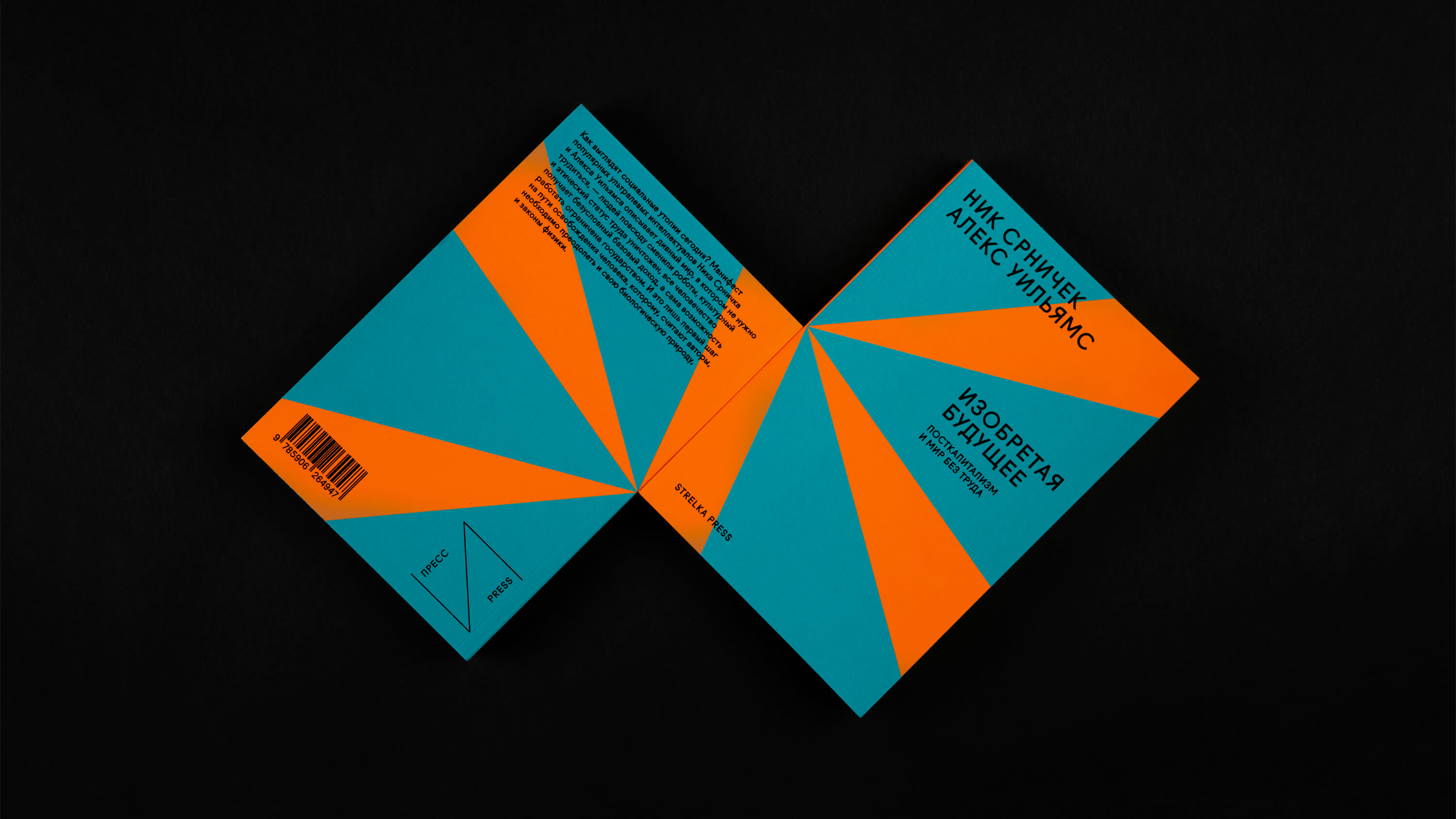
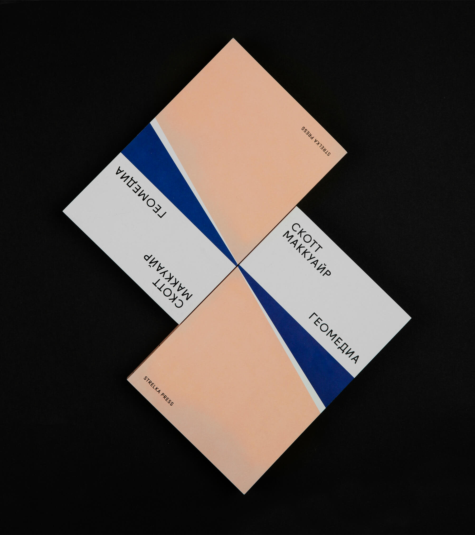
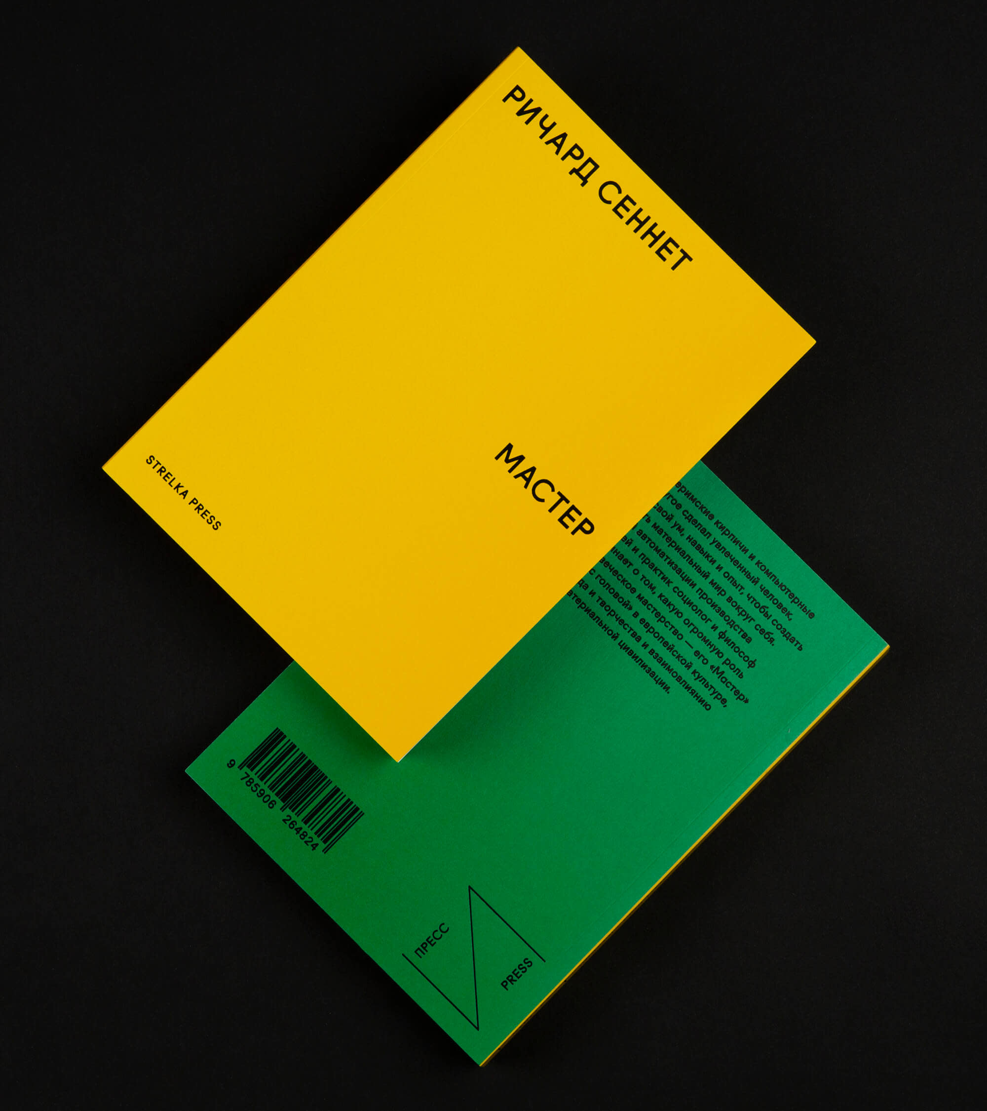
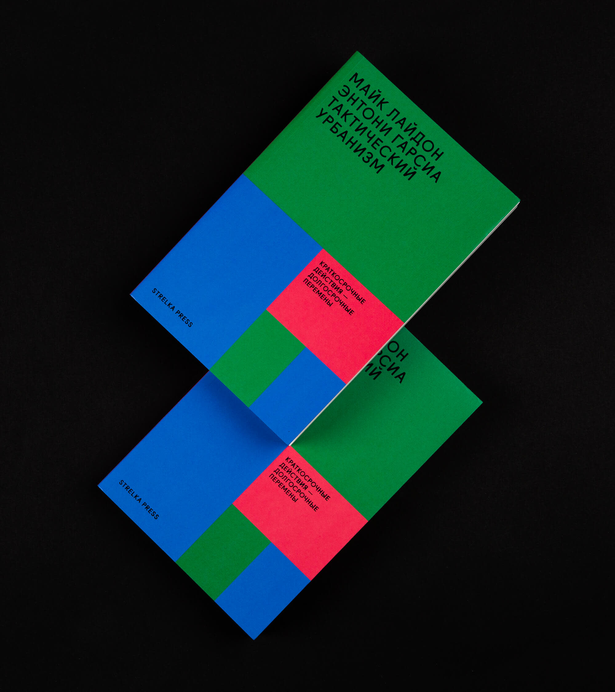
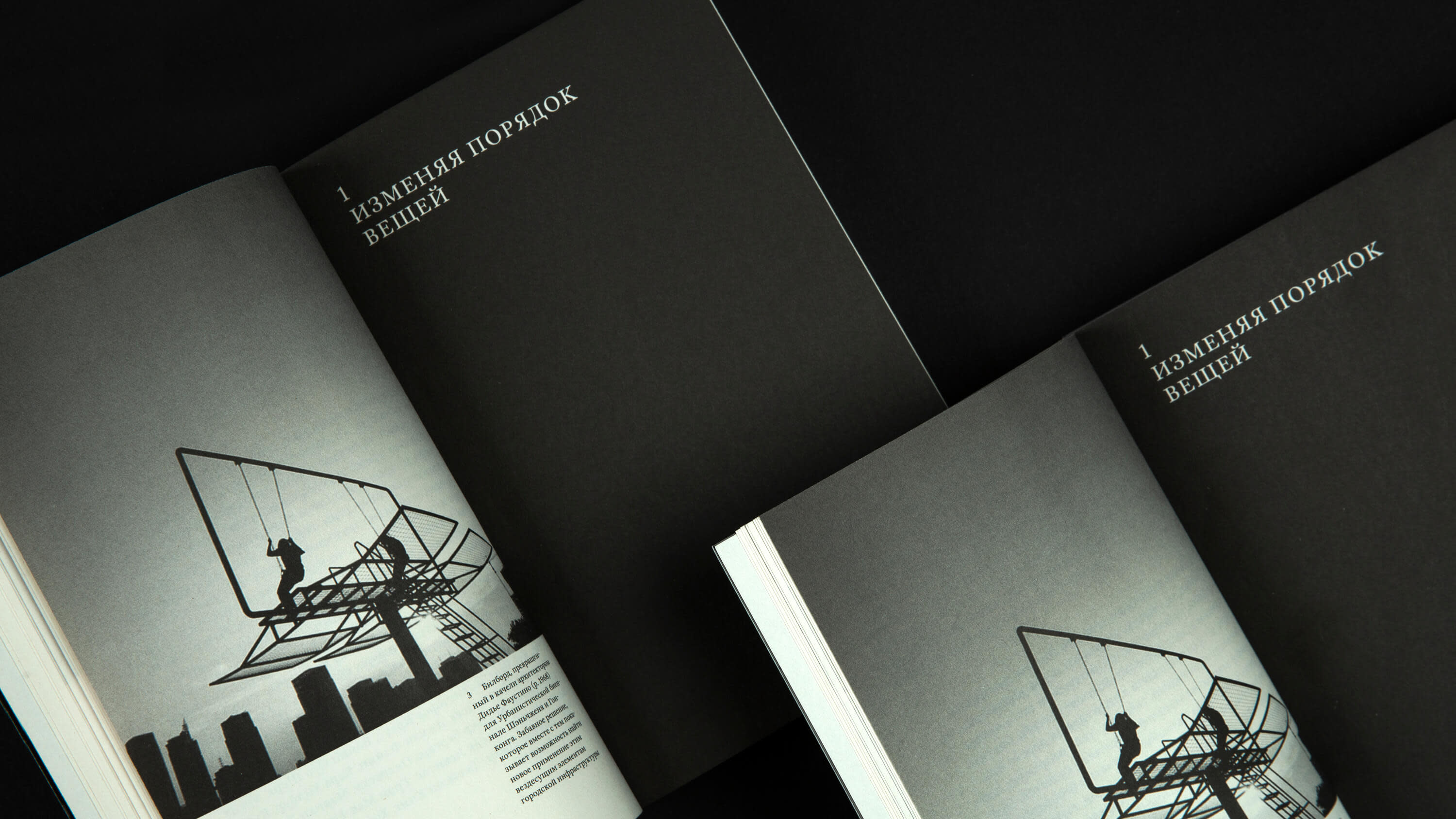
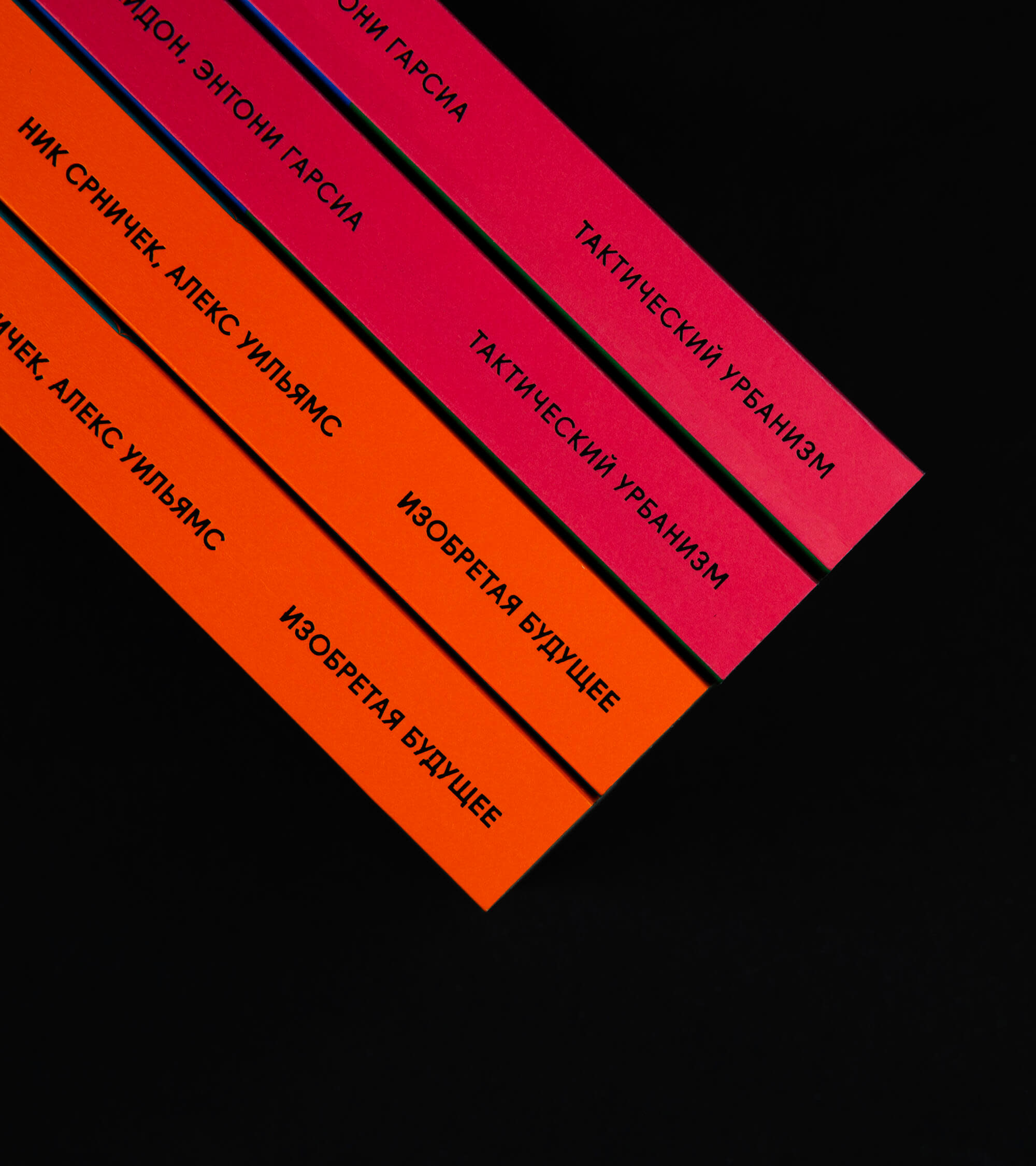
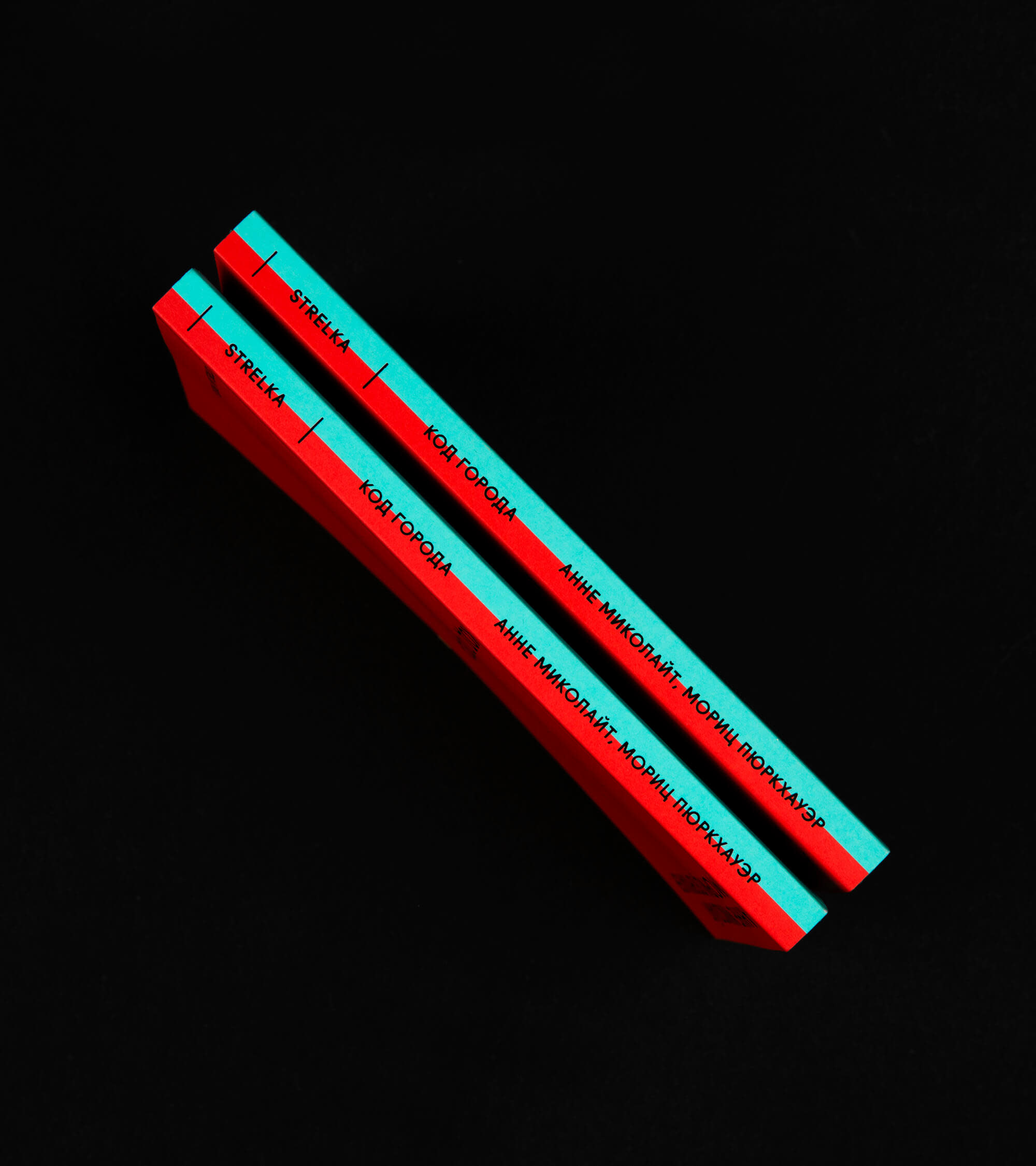
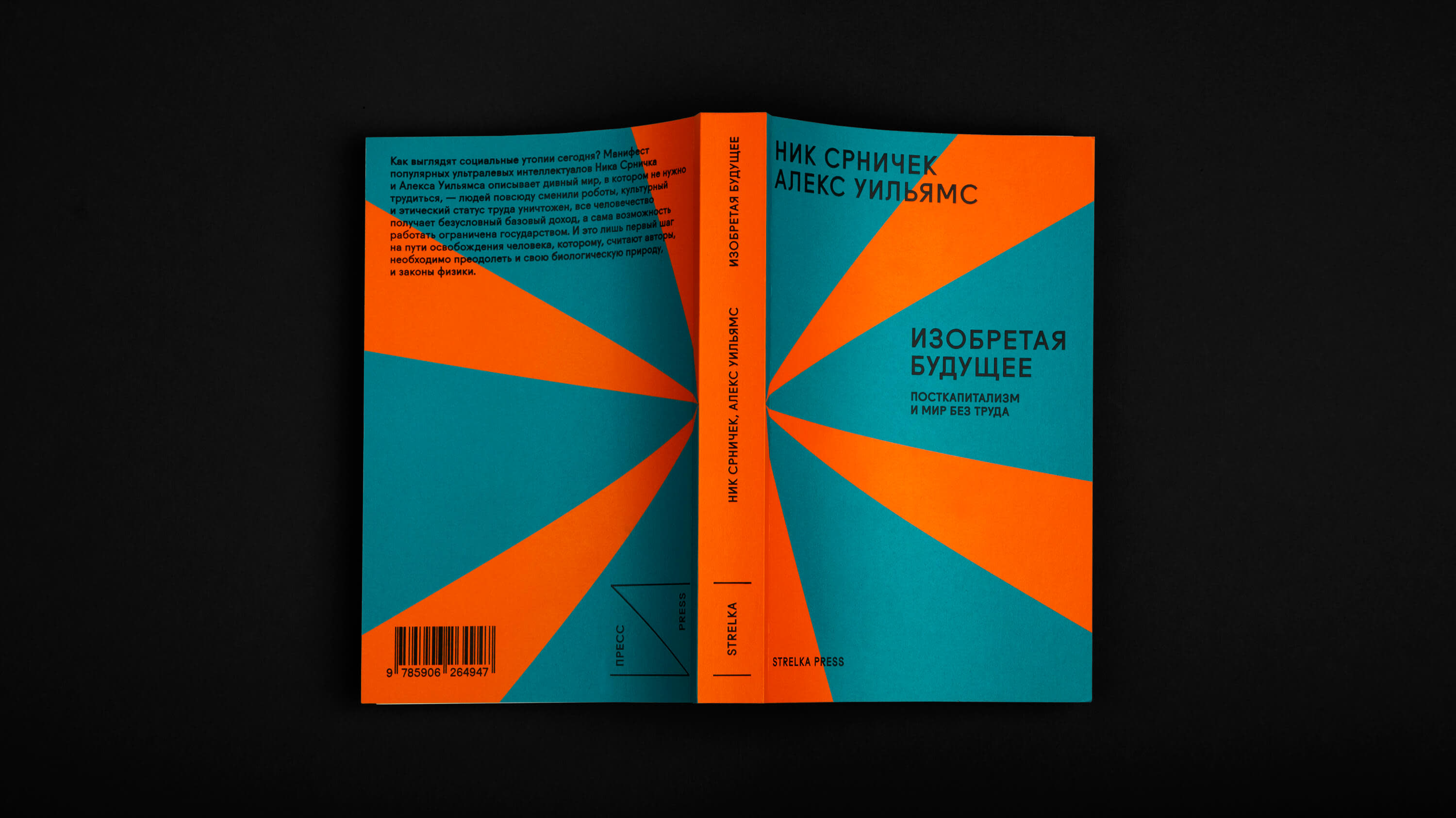
Inside the book, we kept it black and white, but on the outside, we went for two to three vibrant Pantone colors and black foil printing. Thanks to these bold covers, the books stood out on the shelves, and these covers resisted wear and tear, maintaining a neat appearance for a more extended period.
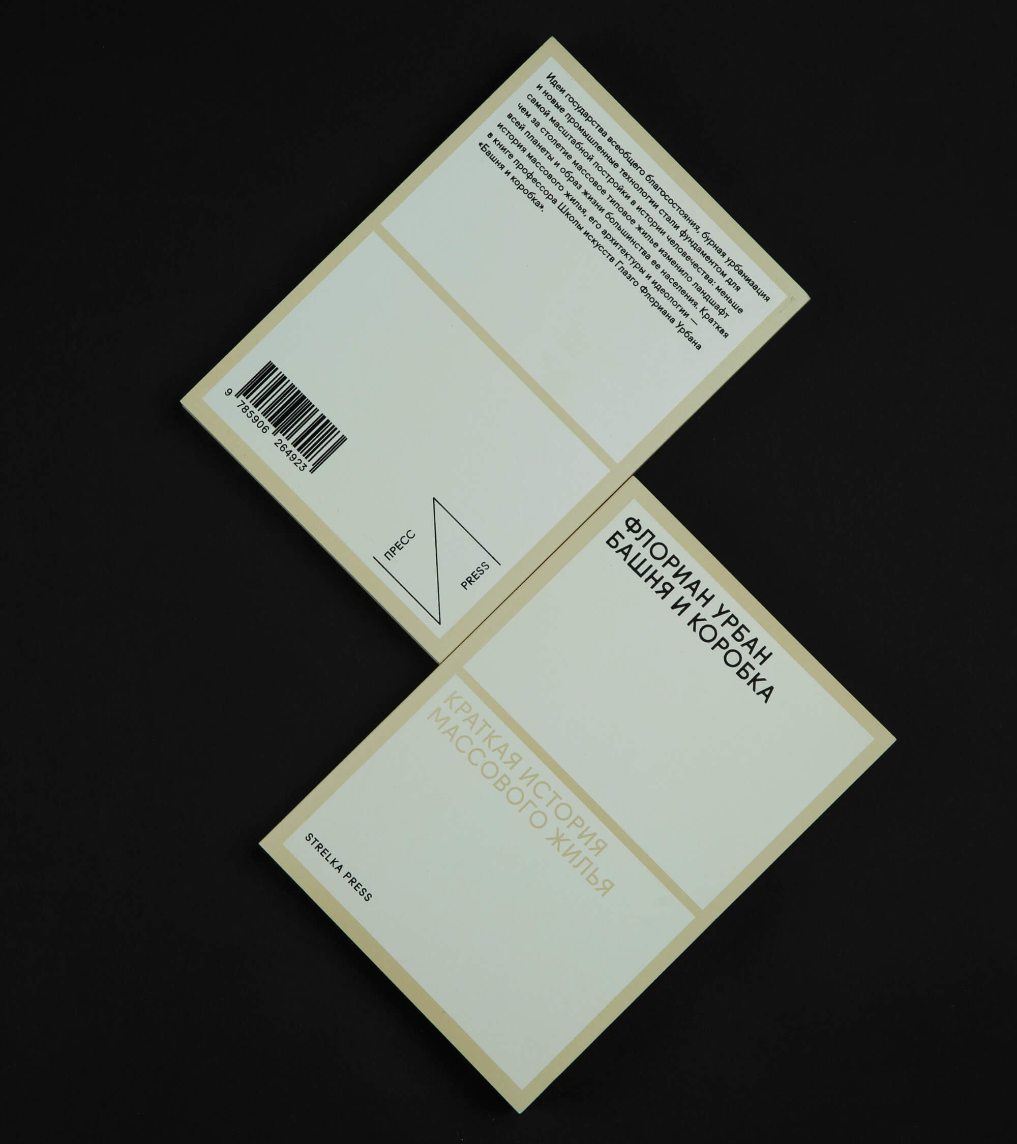
We approached the printing of our books with great care, meticulously selecting the paper for the content and covers, as well as the binding method.
We succeeded in making the books tactilely pleasing: we chose a paper with a warm and pleasant color that didn't strain the eyes. It was incredibly soft, making even thick books open perfectly and be comfortable to hold.
The paper we chose had several options for thickness. This allowed us to finely adjust the spine thickness, ensuring the books didn't appear too thin or too thick.
Strelka Press publishes books of varying lengths, and to accommodate this diversity, I tailored the design solutions for three distinct formats. The largest layout was reserved for more extensive volumes, while a pocket-book format was employed for shorter texts. Despite the differences in size, all three formats adhered to a cohesive and logical system, maintaining consistent design elements throughout.
We consistently considered the color of the book spines. It was important to us that even when nestled among other books on a shelf, ours would stand out and captivate attention with their vibrant hues.
I really appreciate the resulting format system. Despite its absolute flexibility, it remains very consistent. Moreover, the three formats, when stacked together in any combination, turn into a excellent gift.
